The Modrak's
A twist of multiple design styles including Traditional, Modern, and Victorian to name a few. The Range hood cover screams Traditional while the frequent use of horizontal lines is more of a Modern touch. Plus the massive island creates a centralized work station often used in Victorian homes.
original layout


The original kitchen was very dark. The small window creates very limited natural lighting along with the dark cherry cabinets making it feel that much more cave-like.
The flow is also not the best solution. The distance between the fridge and peninsula is too tight. People cannot move through the space easily, or not at all if the refrigerator is open.
The space planning is not using full potential. There is more gray space than there needs to be.
- New Materials -


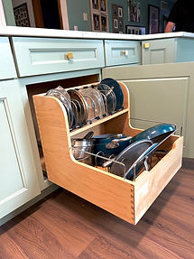
The customers main goal was to gain more storage and seating for their large family.
I removed the peninsula in exchange for an island. The island extends over 13' long, allowing 5 people to sit and dine comfortably together. As the minimum space between each person should be 30". The 6th chair is place on the curved end allowing clearance for an extra person.
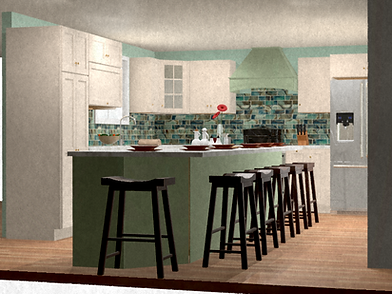

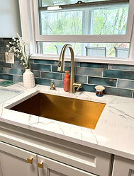


The customer wanted a green tone to match her already green walls but was unsure if it would be too overwhelming. I suggested a two-toned layout to break up the color, make it brighter, and provide some contrast.
new design


